Building a Real-World Python Dashboard with Quarto: Airbnb Analysis
▶️ Watch the Full Tutorial on YouTube
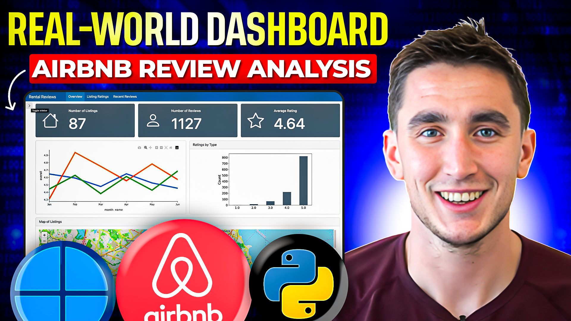
This hands-on tutorial demonstrates how to build a professional dashboard using Quarto and Python, featuring real Airbnb data analysis. The guide progresses from basic layout principles to advanced interactive features, including Shiny integration.
Dashboard Components
The tutorial covers the complete development of an analytical dashboard, including: - Value boxes for key metrics - Data visualization with Matplotlib - Interactive maps using Folium - Multi-page dashboard structure - Interactive tables with itables - Shiny component integration
Technical Implementation
- Setting up basic Quarto dashboard layouts
- Processing and preparing Airbnb data
- Creating various visualization types
- Line graphs for trend analysis
- Bar charts for comparison
- Geographic visualization with Folium
- Implementing interactive elements
- Integrating Shiny functionality
Advanced Topics
- When to choose Quarto vs. Shiny for dashboards
- Hosting solutions with Posit Connect Cloud
- Multi-page dashboard organization
- Bootstrap icon integration
- Custom styling and layout optimization
This guide is perfect for data professionals looking to create interactive, production-ready dashboards that combine both static and dynamic elements.